OVERVIEW
After the launch of a new product tier which featured a 30-day free trial, account creation took a hit with significantly fewer users signing up for accounts — over 75% were not completing the sign-up process. The initiative focused on improving the account creation process for the Hum App.
MY ROLE
I led the effort to pinpoint the cause of the sign-up dropoff and to identify a solution. I validated the approach with research, case study examples, and metrics, then presented it to the cross-functional team (Design, Product, and Development) at multiple levels in order to garner buy-in. I championed the approach to ensure its implementation by communicating with stakeholders and proactively addressing concerns from leadership regarding its viability. In parallel, I developed a plan for App Store Optimization (ASO) to increase visibility and discoverability of the Hum App for organic growth — with the ultimate goal of increasing conversions.
METHODOLOGIES
Comparative Analysis, Competitive Analysis, App Analytics, Sketching, Prototyping, Usability Testing
TOOLS
Adobe Analytics, UserTesting.com, Sketch, InVision, Google Play Store & Console, Apple App Store & Connect
DISCOVERY
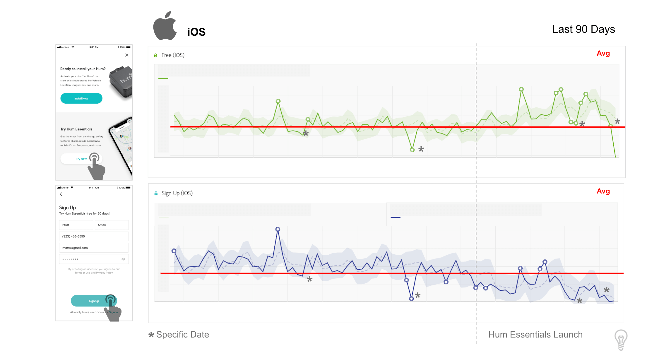
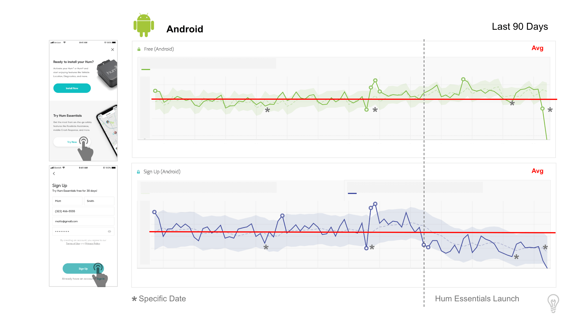
In my quest to identify the cause of the account creation drop-off, I scoured secondary research on form abandonment, conducted a comparative analysis of competitive and industry-leading apps, and monitored the analytics data for the Hum App sign-up flow. From the analytics, I was able to narrow the issue to the sign-up screen.
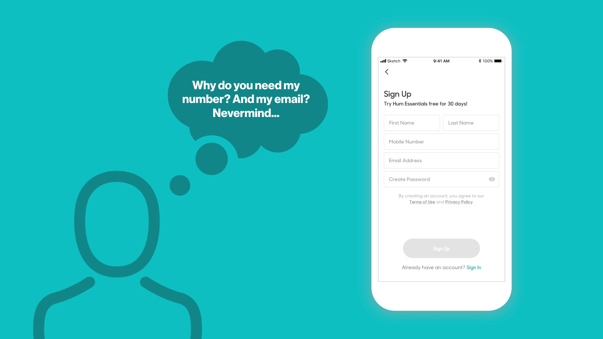
Now that we could definitively say where the dropoff was happening, we needed to validate the exact cause of abandonment. I had identified a prime suspect for the Form Abandonment but needed more evidence to convince my stakeholders.
I observed from the Analytics — funnel conversion and tag hits on the sign-up screen — that mobile number was the primary culprit for users not continuing to sign up and create an account.
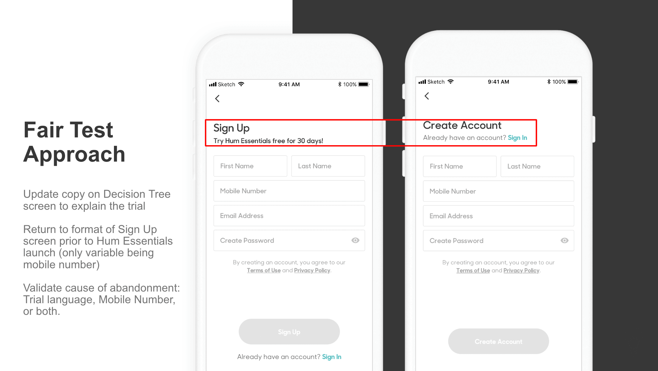
For its low development effort and ability to be released quickly, I recommended a Fair Test to establish a baseline while we iterated on the proposed solution. The fair test entailed returning to the layout of the sign-up screen prior to the new tier launch with the only variable being the addition of the mobile number. The change did lead to a slight decrease in dropoff but did not meet the targeted KPI. Based on this, we had further evidence to validate that the addition of the mobile number was leading to a negative impact on account creation.
PROGRESSIVE DISCLOSURE
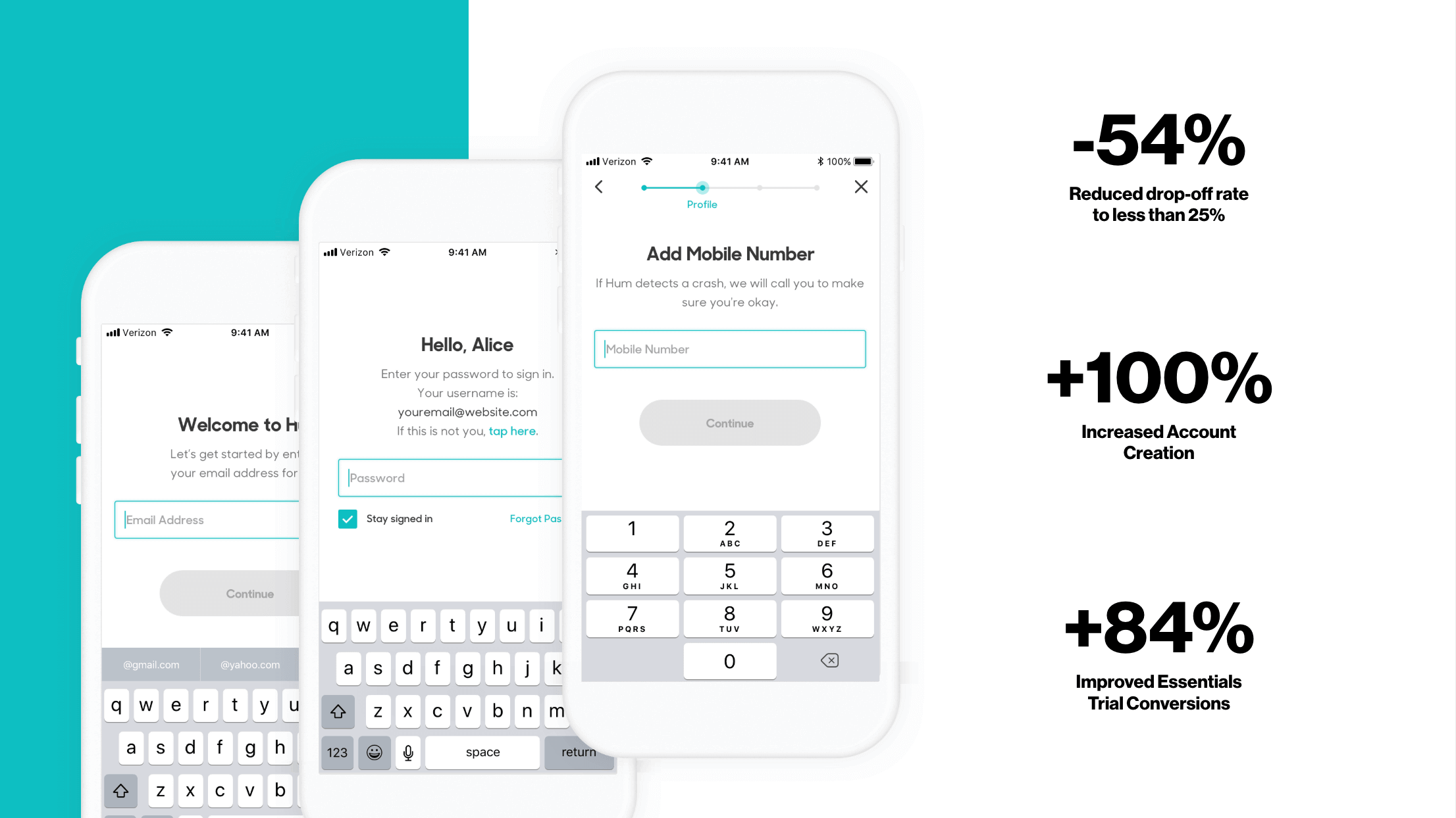
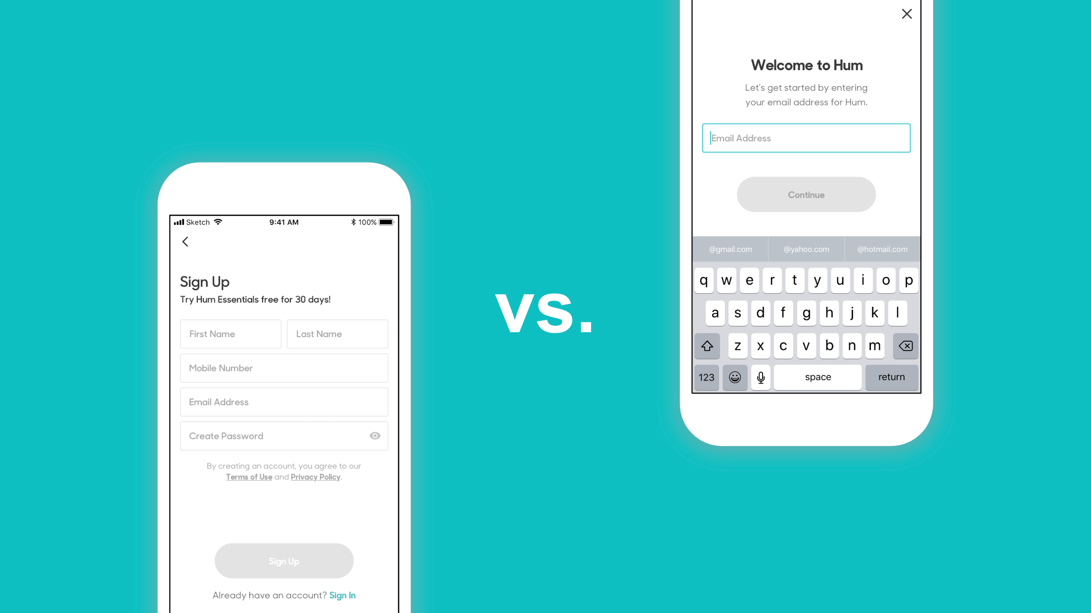
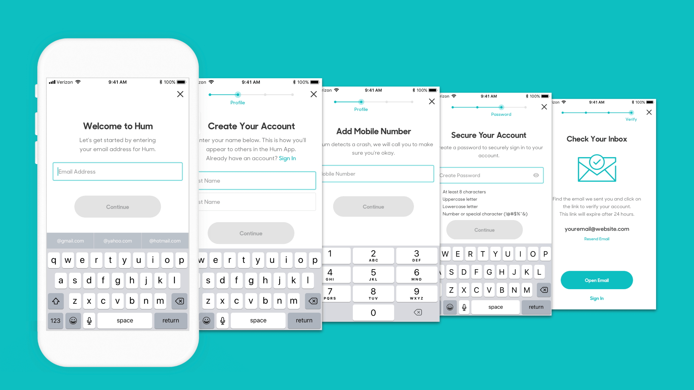
I moved ahead with designing for the proposed solution – Progressive Disclosure or One Thing Per Page. By breaking the experience into multiple steps, I could simplify the account creation process, reduce the drop-off rate, and increase trial conversions.
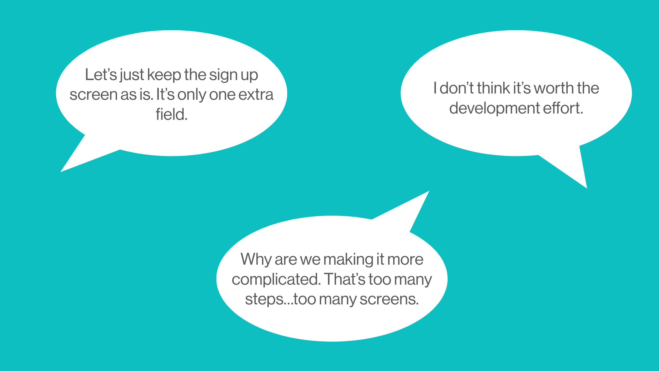
Truth be told, getting buy-in for the progressive disclosure approach took several attempts. The first one acutally being prior to the product launch.
The approach wasn’t a new idea. It wasn’t something that hadn’t been done before in other apps, but it required the team to trust what seemed like a counterintuitive solution — add more steps to make something appear/feel easier to do. Having one thing per page would reduce cognitive load, add a sense of progression as the user moved to the next step, and allow us to explain to the user why we were requesting their information.
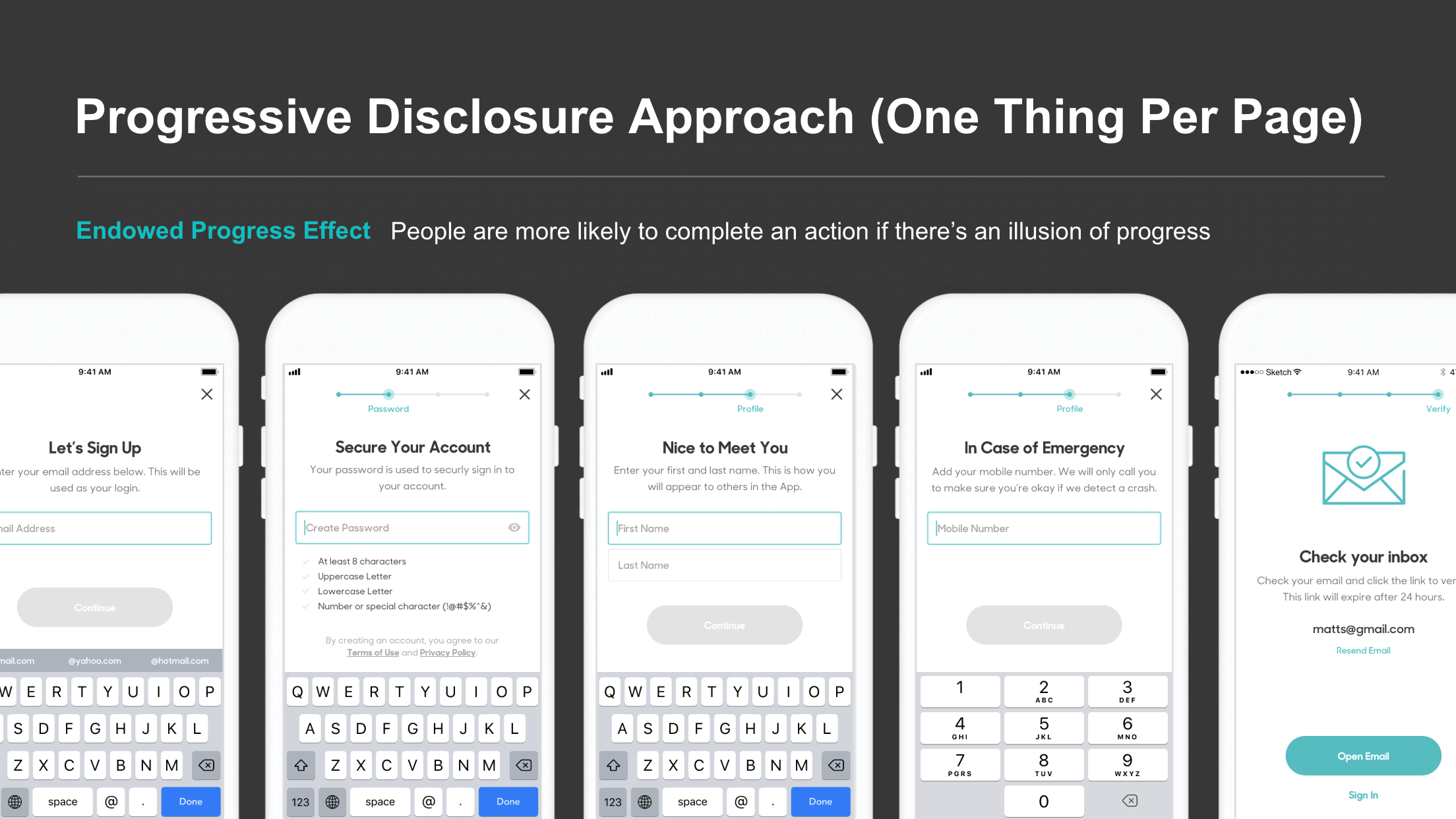
Holding fast to what I knew to be true — experience (user, customer, etc.) is not just about the number of steps, screens, clicks, or taps. It’s about how it makes you feel — I was able to supply the team with the data and rationale needed to support the decision.
ITERATION
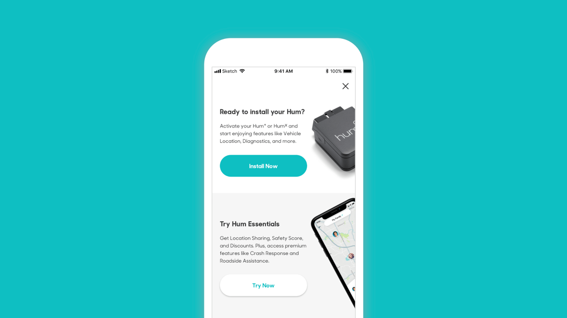
In the iterating upon the design, we also addressed a pre-existing blocker to sign-up — the Decision Tree screen. The Decision Tree screen presented two options to users when they started the sign-up process: Install Hum or Try the App.
Hum offers both an app-only product tier and two other product tiers that include the Hum System (Vehicle Reader and Speaker). Most customers purchase the Hum system in Verizon Retail stores where their accounts are created and linked to their Hum System. Even for customers who purchased the Hum System, this screen was perceived as confusing and often resulted in account creation errors.
To eliminate the decison tree, we collaborted with development to identify a solution that would distinguish between customers who purchased the Hum System and new app-only customers signing up for the trial.
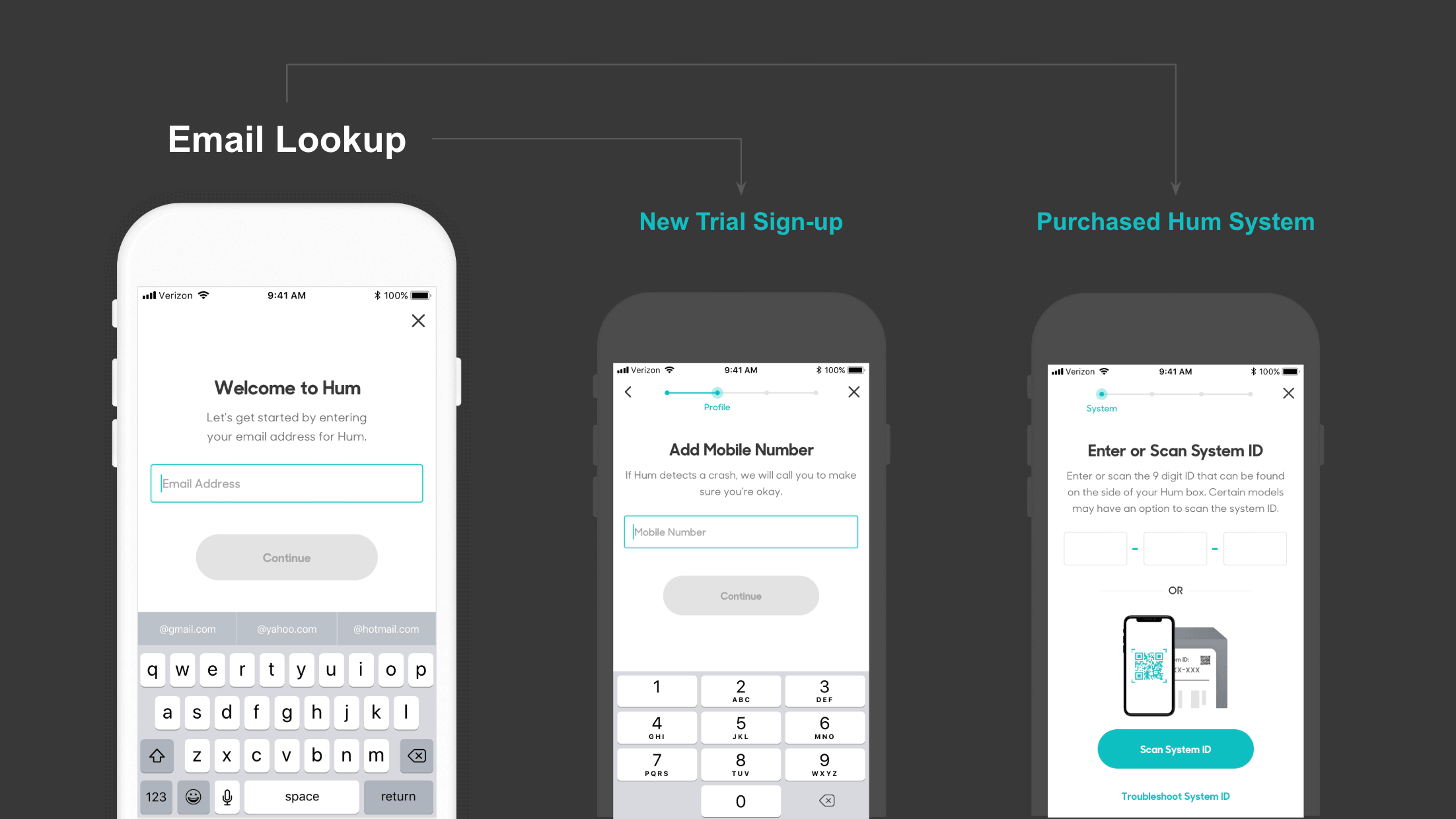
We removed the decision tree and utilized an email lookup to provide a more contextual activation or sign-up experience. Customers who have purchased the Hum System and enter an email associated with that account are directed to the Activation Screen. All other customers are sent down the path to create a trial account.
APP STORE OPTIMIZATION
Simultaneously, I developed a plan for App Store Optimization levering data from the Apple App Store and the Google Play Store. I identified KPI metrics for tracking performance and presented the plan to my team and stakeholders.
I monitored the organic conversion rate, product page views, new installs, and downloads to establish a benchmark for the KPIs and to track app performance before and after the updates.
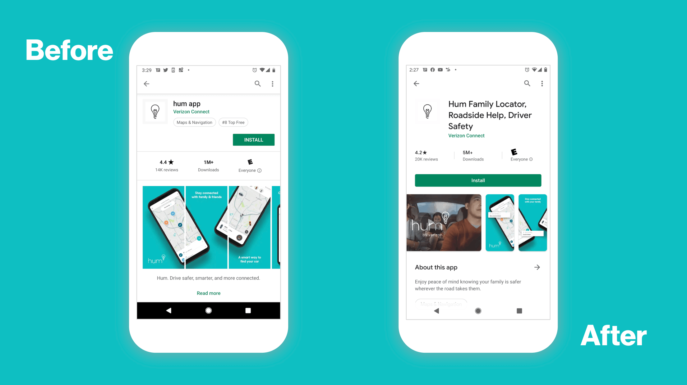
The plan focused on updating the following elements on the Product Page/Store Listing for the Hum App:
- Changing the App Title to be more descriptive and competitive
- Adding App Sub-Categories to broaden the reach
- Updating Screenshots to better communicate app features
- Adding a Video to highlight the value prop
- Maximizing keywords to increase visibility during search and exploration/browsing
RESULTS
Ultimately, the approach worked. Account creation dropoff decreased from over 75% to less than 25%, resulting in a 100% increase in daily signups for trial accounts. Trial conversions also increased by 84%.
