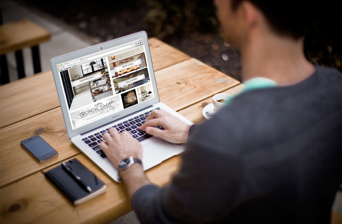
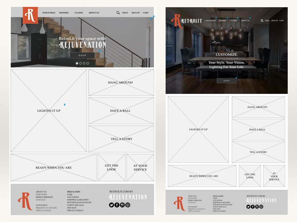
Lifestyle microsite featuring curated selection of Rejuvenation’s lighting products. Showcasing style-based navigation and enhanced product and checkout pages with viewing options, shipping details, and product suggestions.
PROJECT OVERVIEW
Rejuvenation is a classic American lighting and house parts general store for home improvement whose mission is to add real value to homes, buildings, and projects. For this project, I created a lifestyle microsite from a curated selection of Rejuvenation’s lighting products. I identified top navigation categories via card sorting and enhanced the product and checkout pages with viewing options, shipping details, and product suggestions.
MY ROLE
As the sole UX designer for this project, I conducted all of the research, information architecture, wireframing, and testing.
Methodologies
Brand Assessment, Competitive Analysis, Card Sorting, User Journeys and Flows, Site Map, Sketching, Wireframes, Prototyping, User Testing
Tools
Axure, Photoshop, and Keynote
RESEARCH + ANALYSIS
I began my process by reviewing the previously identified persona of Paul “The Prestige,” a user who desires quality and values status. I continued with an assessment of the Rejuvenation brand by interviewing the store manager and reviewing corporate branding elements. I also conducted an industry review to get a better understanding of lighting trends.
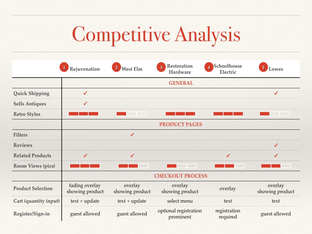
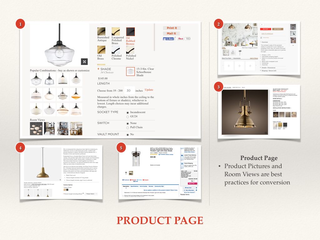
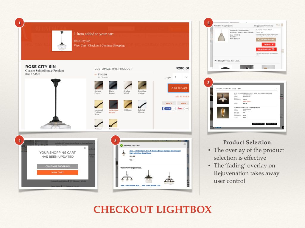
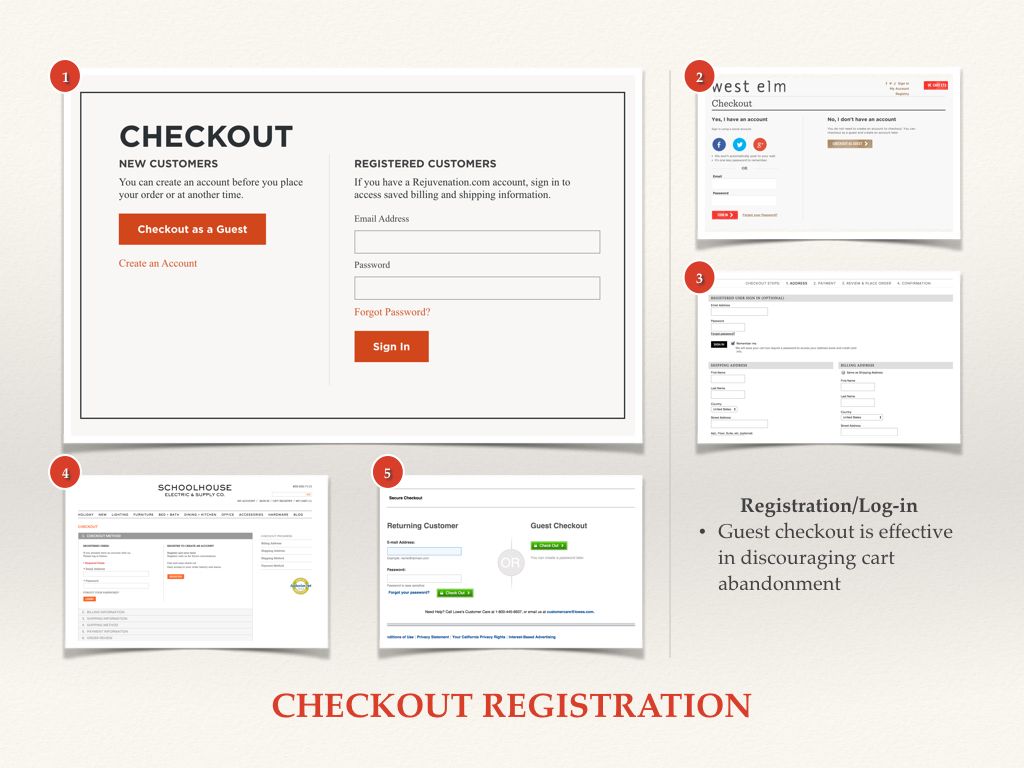
I then moved on to conducting a competitive analysis of four competitors’ sites in order to see how Rejuvenation was performing in comparison to the other retailers. As a result, I was able to identify the differentiating factors of my retailer and opportunities for improvement to incorporate into my design.
CARD SORTING
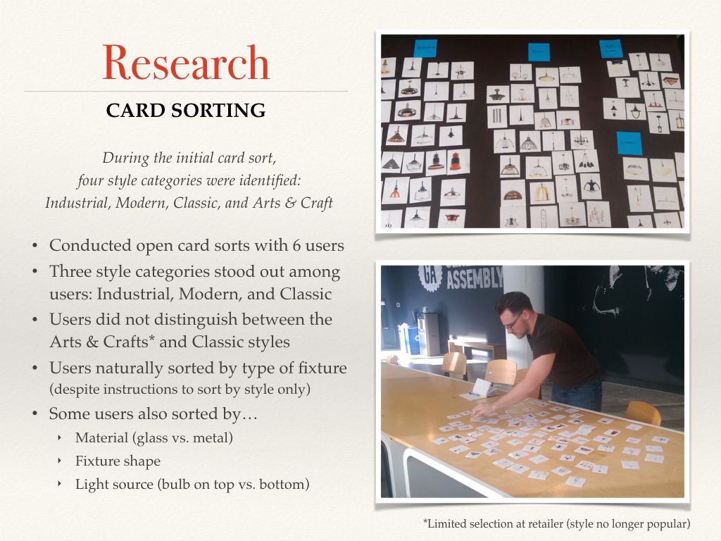
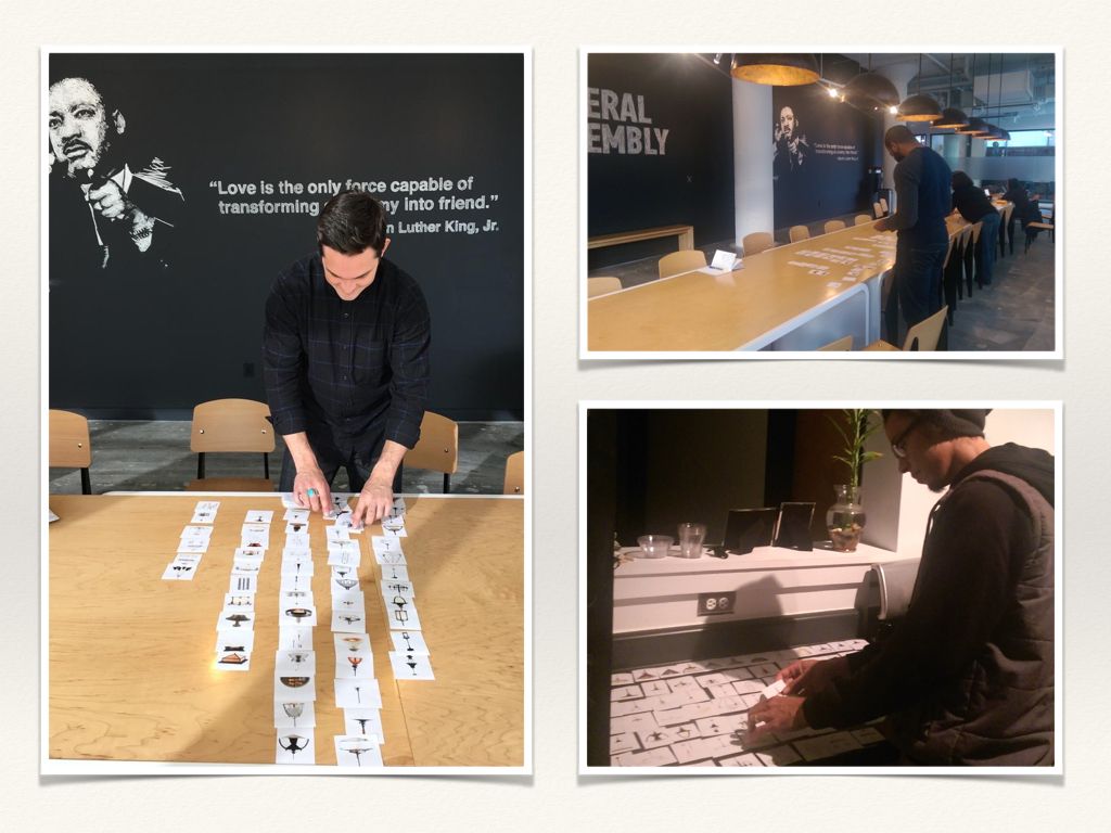
I selected 100 lighting fixtures from Rejuvenation’s site and conducted six open card sorts to see any patterns among users. Based on the persona and the results of the card sorting, I was able to develop a concept for the microsite and begin designing the information architecture.
SOLUTION
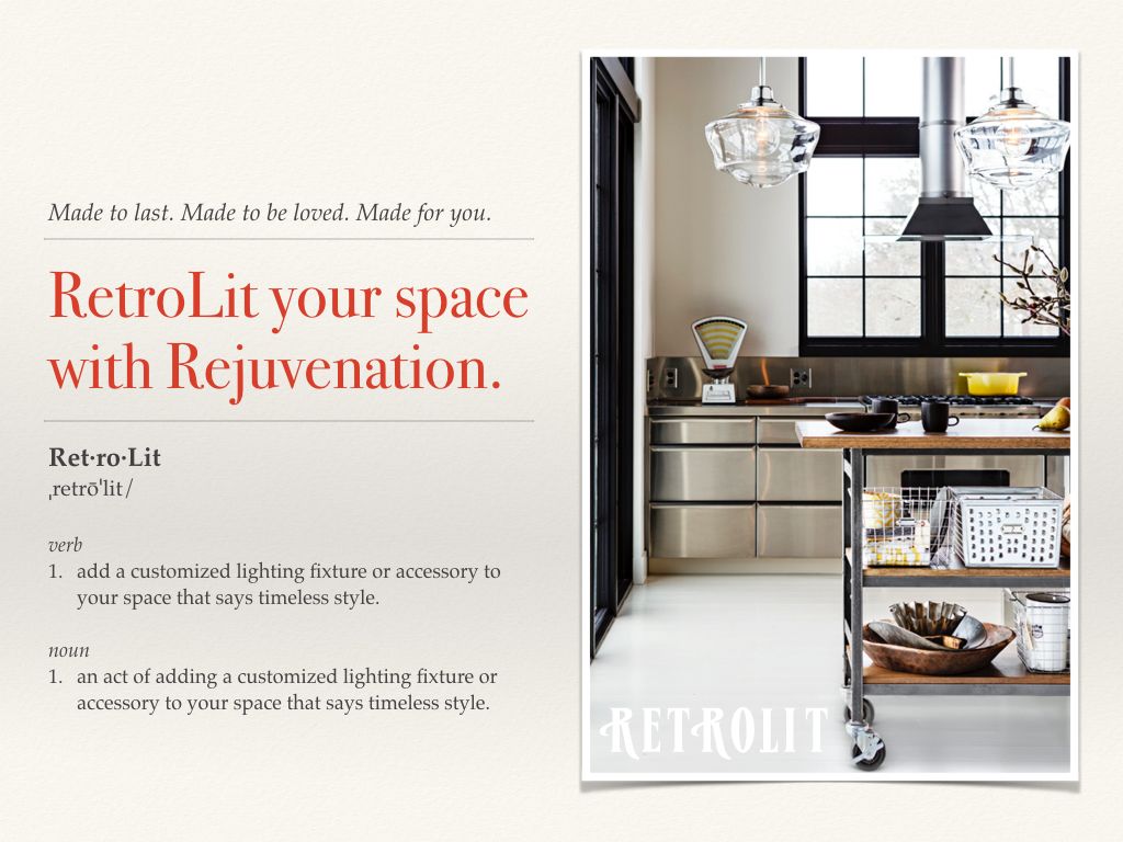
Based on my findings from the industry review and card sorting, the solution became a lifestyle microsite featuring retro-inspired lighting fixtures organized by style.
RetroLit.com is for style conscious consumers with discriminating taste who want more than your standard run of the mill lighting solutions. If it can be purchased at Home Deport or Lowe’s, they don’t want it. They want stylish, customized solutions that will light up their spaces and make a statement. RetroLit.com will help them bring their vision to light and create the look they want.”
SITE MAP + USER JOURNEY/FLOW
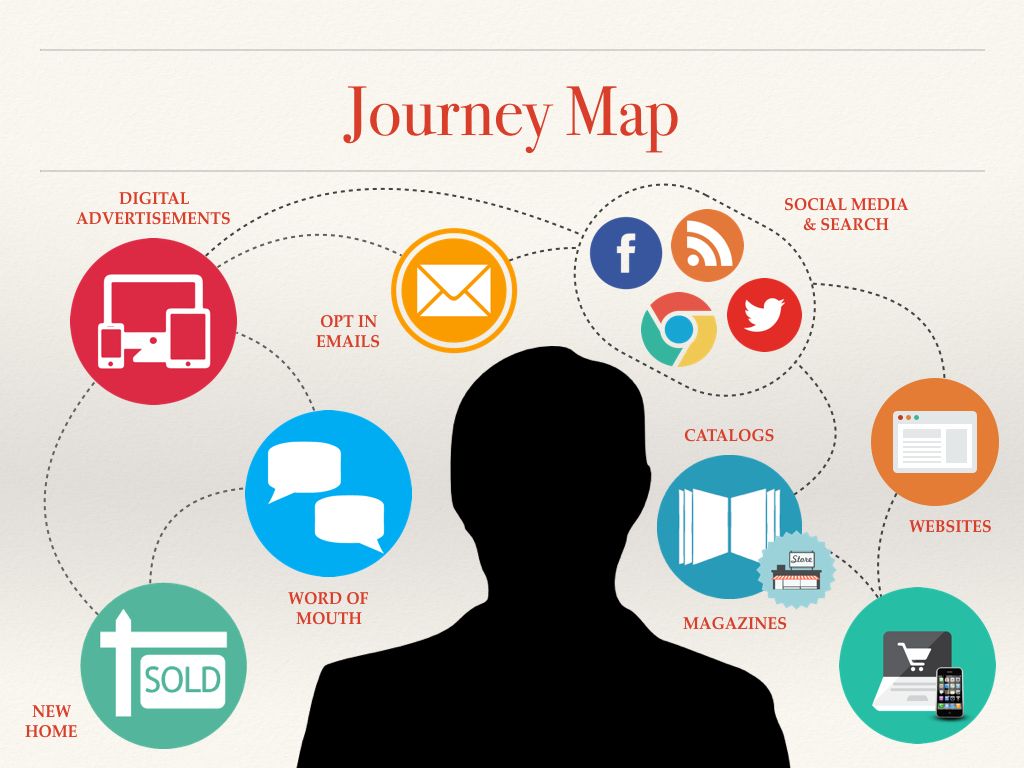
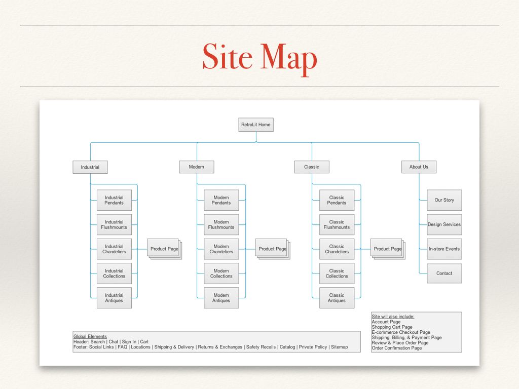
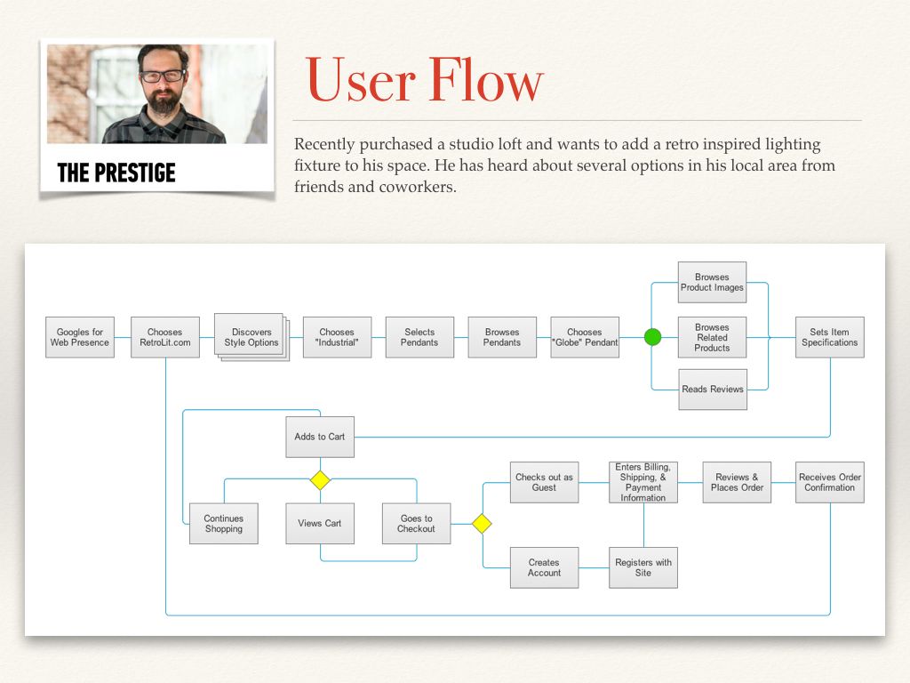
I developed the site map and user flow to define the path of the user through the microsite. To further define the experience from the user’s perspective, I also created a journey map to capture the various touch points and interactions the user experiences in his/her journey to the microsite. Doing this added a layer of understanding from the user’s perspective about the relationship and positioning of the microsite (click images to enlarge).
WIREFRAMES
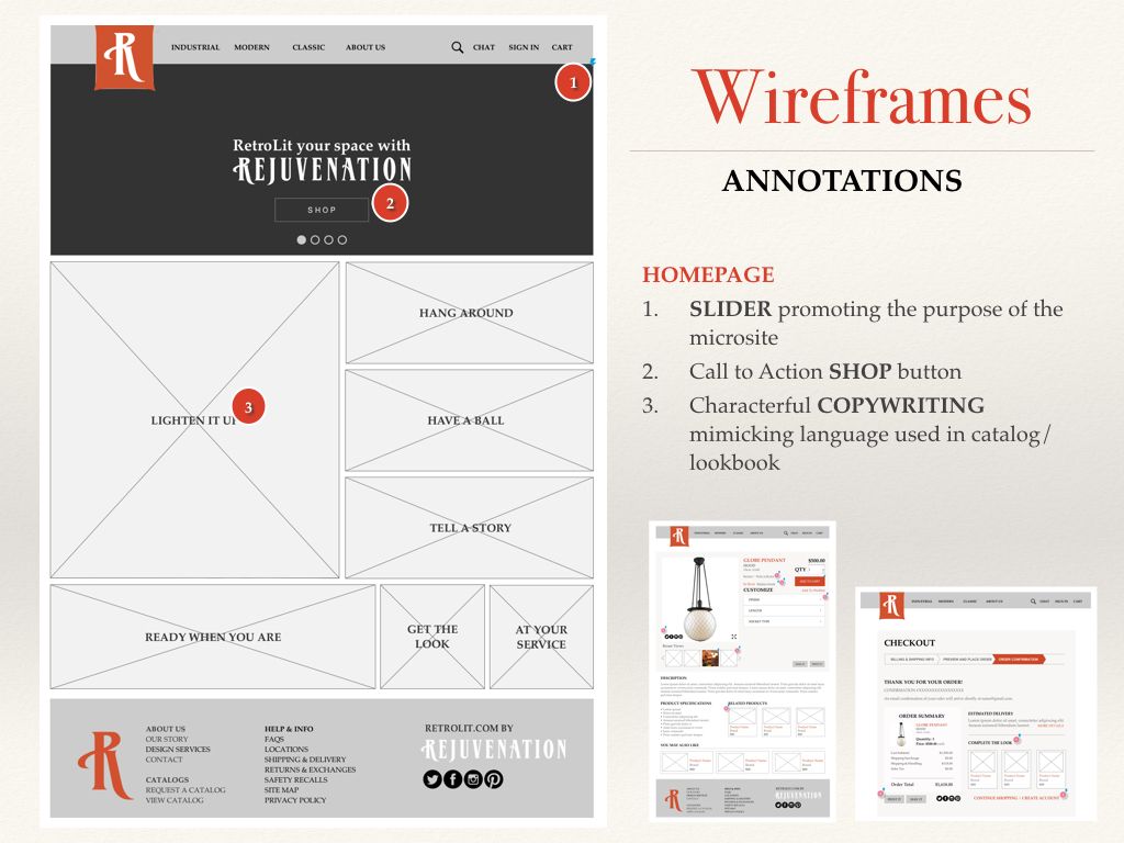
I used Axure to build my wireframes for the microsite. The full prototype was created using only wireframes, with a high fidelity homepage mockup created afterwards.
TESTING + ITERATION
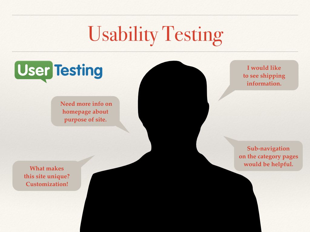
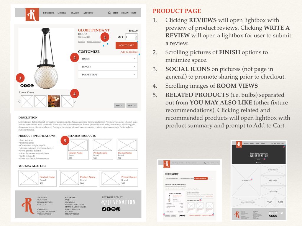
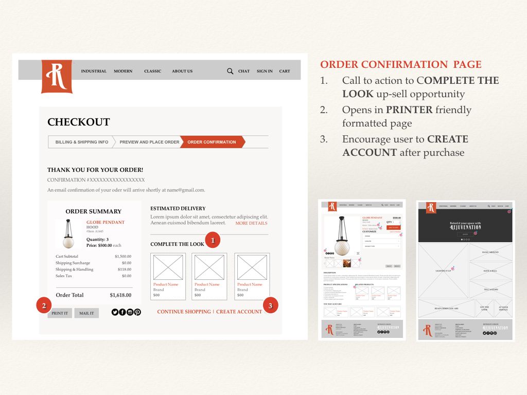
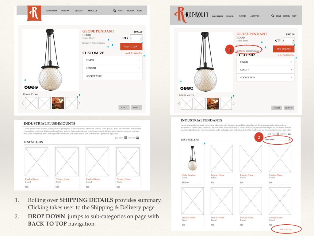
I conducted usability testing with five users — four in person and one via UserTesting.com. The usability testing was very effective in highlighting areas in need of improvement. I used the key takeaways from the user feedback to iterate on the design of my microsite in order to clarify the site’s purpose and add features desired by the users. The improvements included enhancing the product and checkout pages with viewing options, shipping details, and product suggestions (click images to enlarge).
WEB + MOBILE PROTOTYPES
Take a look at the web and mobile prototypes below.
