OVERVIEW
Coca-Cola has thousands of websites across its various brands and business units. The company recently launched a platform to streamline website creation and maintenance for branding and analytic purposes across the organization. My teammate and I were tasked with designing an analytics solution that could help employees at various levels (analyst, manager, and director) make editorial and content decisions for Coca-cola’s websites through effective data management and visualization. We worked within the constraints of 3 weeks with the mandatories of ease of use, responsiveness, and turnkey implementation.
MY ROLE
My role in this project included project management, comparative analysis, user interviews, persona development, information architecture, visual design, prototyping, and user testing.
METHODOLOGIES
Comparative Analysis, User Interviews, Card Sorting, Persona Development, User Journeys and Flows, Site Map, Sketching, Wireframes, High Fidelity Comps, Prototyping, User Testing
TOOLS
Axure, Sketch, Illustrator, Photoshop, Marvel, Keynote
DISCOVERY
Our process began with discovery which included comparative analysis for feature inspiration and user interviews to identify frustrations, needs, and expectations of the user. We also conducted research on data visualization to identify best practices and pitfalls. I developed our comparative analysis framework and filtered the feedback from the user interviews in order to think through possible solutions and to begin developing our personas. During the user interviews, I also implemented a card sorting technique in which the users were asked to manually build their ideal dashboard. This helped us to start visualizing the possible solutions.
PERSONAS + USER STORY/JOURNEY
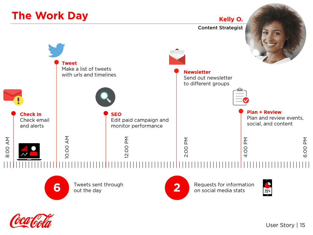
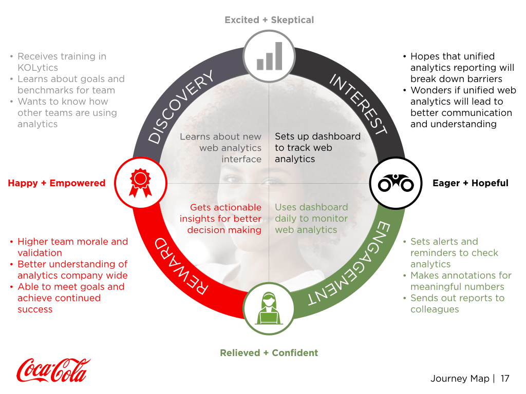
I developed three personas based on the use cases most associated with the platform (analyst, manager, and director). I focused on the user story and journey of our analyst persona, Kelly. O, as the user with the most touchpoints. Below represents Kelly’s path from being introduced to the analytic dashboard to daily use and acceptance along with the emotions she may encounter (click images to enlarge).
IDEATION + SKETCHING
We worked on our sketches independently then came together to collaborate and identify our course of action. At this stage, we solicited feedback from colleagues and other professionals to hone in on the design.
TESTING + ITERATION
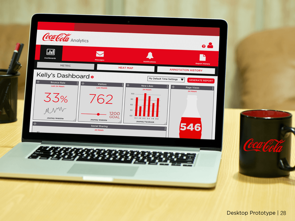
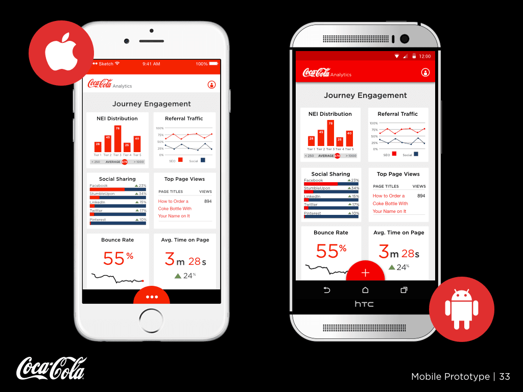
We developed our desktop and mobile wireframes in Axure and iterated upon the designs via user testing. Based on feedback from testing, we streamlined the dashboard and restructured the architecture on both the desktop and mobile versions. After incorporating our changes, I built our high-fidelity mobile prototype (my teammate built the desktop prototype) in Sketch and Marvel and did another round of user testing. I also developed the site map and user flow for the site.
DESKTOP + MOBILE PROTOTYPES
Select the desktop or mobile prototype below to take a tour.
I’m blown away. Gorgeous presentation. Really gorgeous prototype. Everything I saw is something we could take advantage of… the ease of use, the intuitiveness… I looked at this interface and it just made sense. No training needed… Great insights, too. This is a clear expression of what people are looking for.”
–Dan Dawson, Coca-Cola client


